
This is General Motors’ logo since 2015:

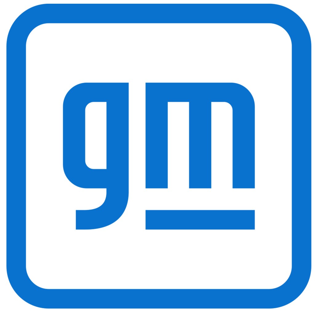
This is GM’s logo since today:
While the kerning on the top logo looks a bit off (look at the top left of the “M” in relation to the “G”), it does have an appearance that one could argue is “classic” General Motors: A substantive, staid business that is solid (especially with the horizontal bar, which appears as though it could be made out of ultra-high-strength steel).
It looks as though it is saying: “This is a Fortune 500 company.”
The new logo is different.
It is friendlier. More casual.
Something that could be affixed to a trendy bag or arm patch on a technical jacket.
If the top logo is that of a company on the Dow Jones, the new logo is one that says, “I’m not out of place in the S&P”–the index that includes Apple, Microsoft, Amazon, Facebook. . .and Tesla.
Sharon Gauci, GM executive director of Global Industrial Design, said of the new design was carefully ideated and crafted: “At every step we wanted to be intentional and deliberate because this logo signifies creative and innovative thinking across the global General Motors family.”
One of the objectives of the new logo is to telegraph a message that GM, especially as it undertakes a massive electrification effort–30 electric vehicles globally by the end of 2025–and is a leader in autonomous driving tech, is an of-the-moment relevant company, not a classic, predictable manufacturer of shiny metal objects.
Of course, people buy vehicles, not logos (in 2005 GM started putting postage-stamp size GM logos on all of its vehicles, which is stopped doing in 2009), so the graphic design team has done their bit, now it is up to the rest of the organization to deliver.–gsv
