Some Things About the Peugeot 308 SW

A new vehicle with some interesting characteristics

By Gary S. Vasilash

Peugeot has rolled out with a new vehicle, the 308 SW with, given the profile of the vehicle, the “SW” standing for “station wagon,” although that is probably not the case given that station wagons aren’t called “station wagons” in France or other parts of Europe where the 308 SW will be sold.

All that said, it looks like a station wagon.

New Peugeot 308 SW. (Image: Peugeot)

There are several interesting things about this vehicle that Peugeot thinks is important to know.

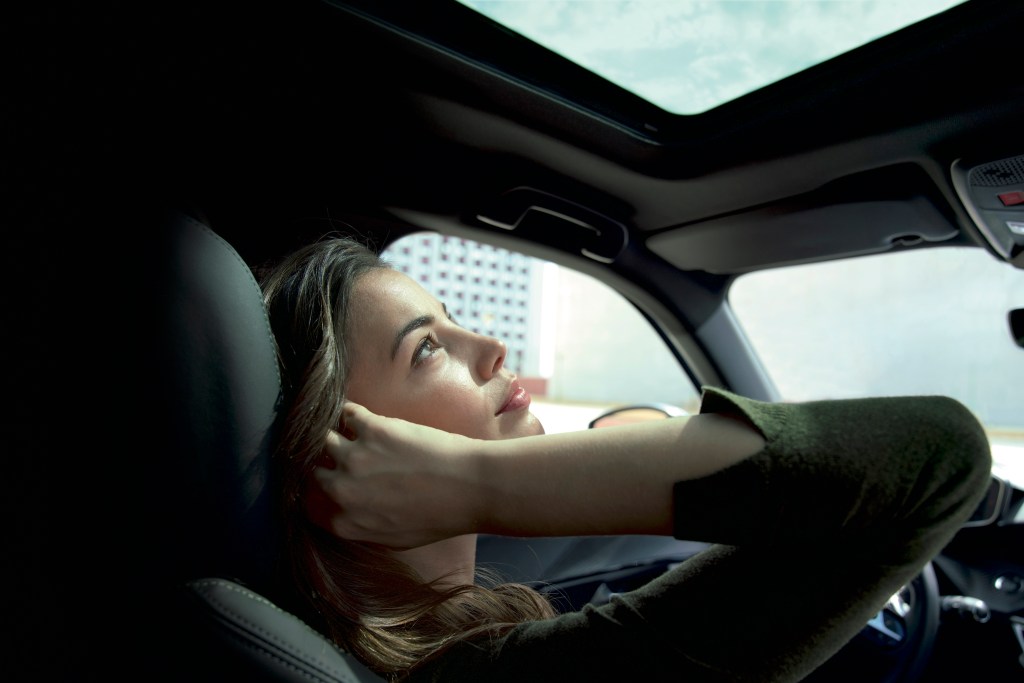
For example, there are several places to put things on the interior of the vehicle, places that are “entirely dedicated to well-being and practicality.” That’s one way of describing those places that often end up being sticky on the bottom surface and full of random debris.

The vehicle can be purchased entirely on line (depending on the country, of course: something that wouldn’t happen in the U.S. unless a dealer is involved, the vehicle is a Tesla or it is a used car).

The 308 SW can be equipped with an array of powertrains, ranging from gasoline engines to hybrids to, yes, even diesels.

The steering wheel is, for some reason, compact. Outside of a school bus or a Class 8 truck, are there really oversized steering wheels in vehicles?

And then there’s this: the 308 SW offers a cargo volume that can accommodate “608 litres of water and up to 1634 litres of water with the seat fully folded.”

To be sure, there are many ways of measuring cargo space, from luggage to Amazon Prime boxes to jellybeans (sweepstakes use, only).

But water?

On Peugeot’s New Logo

The first change for the French automaker since 2010

2021 is the year that automakers are changing logos, ostensibly to make them seem more relevant in a world of advancing technologies.

First there was Kia. It had its name spelled out with a font with awkwardly sized letter stems housed in an oval. It truly appeared as though it was something that would be affixed to a product in the Dollar Store rather than on some of the best-designed vehicles on the market. The new one is a digitally driven design with the sort of typographic flow that one would associate with advanced technology.

General Motors was not to be outdone (although arguably it was by Kia’s design), revealing a new badge that went from uppercase letters with a horizontal bar beneath them reversed out of a square blue background to two lowercase letters with the horizontal bar underlining over the “m” in a rounded square box (squircle?). While the previous badge was simply a statement of acryomic identity, the new version is meant to signify the electric future, as the shape of the “m” combined with the bar beneath it resembles an electric plug.

(Image: Peugeot)

Now Peugeot has made a change its logo. It is worth noting that Peugeot, which is 210 years old, first used a lion as part of its logo since 1847, so there is something to be said for consistency. (The original logo was used on steel products the company produced; it didn’t appear on a car until 1948, on a Peugeot 203.)

The new logo, designed by Peugeot Design Lab, a wholly owned operation within what is now part of Stellantis that designs everything from pepper mills to scooters, features a lion’s head within a badge form, with the name “Peugeot” in all caps, slightly curved to echo the curve at the top of the shield.

According to Matthias Hossann, Peugeot Design Director, “With over two centuries of history, Peugeot is a pioneer of mobility and a legendary brand for automobiles and bicycles. This emblem and this new brand identity are a link between our history and our vision for the future. This logo has been conceived, designed and developed in-house with the same stringent requirements that we apply to every detail of our vehicles: the quality of materials, the quality of execution and the quality of the finish.”

Although Peugeot is in the process, like seemingly all automakers, electrifying everything, notably this new logo doesn’t stress that change through some sort of potentially hokey maneuver like making the lion’s mane consist of lightning bolts.

More relevant to the purpose of a logo—to be widely seen and identified with a brand—is that the design team specifically worked on developing the marque such that it is optimized for digital use.

After all, where do you see more logos than in digital spaces nowadays?

Cars as Sanctuary

Getting away from it all without going anywhere

There’s a Lincoln TV commercial showing a woman who goes into her house and sees the ruckus that’s occurring in there among members of, presumably, her family, so she slips back out the door and into the calm cabin of her Lincoln SUV.

Turns out that that sort of thing is real. So indicates research done by Peugeot UK (yes, I know I’m mixing brands here).

Peugeot UK finds that some people are using their vehicles as spaces for relaxation. (Image: Peugeot)

The company found that 41% of those surveyed said that because of the pandemic-driven lockdown they’ve been using their vehicles for other activities.

  • 58% said it is a place of calm
  • 47% watched TV
  • 43% read books

Although lockdowns and stay-at-home orders will, one hopes, go away in the U.K. (as well as everywhere else) in the not-too-distant future, this use of vehicles for things other than transport may continue.

If they had a zero-emission vehicle (not coincidentally Peugeot has vehicles like the e-2008 electric vehicle), 37% would continue to use their vehicle as an alternative space.

Why? Because the electric motor would allow interior climate control without any exhaust.